Android 17 vs iOS 27 — Which Platform Does Lock Screen Widgets Best?
- Tags
- Apple
- iOS 27
- Tech News
- Smartphones
- Android 17
- Widgets
Introduction: The Battle for the Lock Screen
Lock screen widgets have made a massive comeback across modern smartphones, but Google and Apple have taken drastically different approaches to implementing them. While Android once pioneered widget ecosystems, it temporarily dropped lock screen widgets before bringing them back in recent iterations like Android 16 and refined further in Android 17. Meanwhile, Apple introduced them with iOS 16 and has continued to refine them up through iOS 27.
Both platforms treat lock screen widgets uniquely. This comprehensive comparison explores how they work on both operating systems, how to set them up, and ultimately determines which platform delivers the best user experience.
How to Set Up Lock Screen Widgets
Getting started with lock screen widgets varies slightly between the two operating systems, though both interfaces have been streamlined for ease of use.
Setting Up on Android 17
On Android, the easiest way to access and customize your lock screen widgets is by locking your phone and swiping from the right side of the screen. A prompt will guide you to tap the 'Add widgets' button. From there, the setup mirrors the familiar home screen widget experience: select your preferred app, choose a design layout, and place it on your custom widget pages.
Setting Up on iOS 27
On Apple's iOS, customization begins by pressing and holding your locked screen until the editor appears, then tapping 'Customize'. By tapping 'Add widgets' in the bottom toolbar, you can select from available applications and choose your preferred tile style.
How Lock Screen Widgets Work on iOS 27
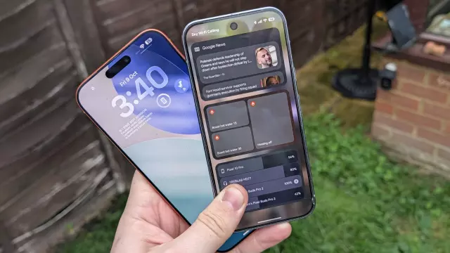
Apple’s implementation places widgets front and center, ensuring high visibility right beneath or above the clock. However, space is severely restricted. iOS limits you to a single horizontal line of the screen, accommodating up to four smaller tiles (or equivalent larger widgets). Once that line fills up, you cannot add more.
Most iOS widgets focus on at-a-glance information—such as calendar events, health metrics, and time—or act as quick app shortcuts. However, third-party support can feel selective, and many smart home or sensitive applications require you to fully unlock the device to perform actions. Additionally, iOS lets you position your widget bar either right under the clock or at the bottom of the screen.
How Lock Screen Widgets Work on Android 17
Android’s approach feels reminiscent of Apple's pre-iOS 14 widget page setup. Instead of cramming everything onto a single line, Android lets you swipe from the right side of your lock screen to access dedicated widget pages. You are limited to three widgets per page, but you can create multiple pages.
Much like standard Android home screen widgets, the variety and design choices are extensive. While you can control certain non-sensitive features directly (like smart home toggles), triggering sensitive actions—such as checking your calendar or emails—will prompt you to unlock your phone for security purposes.
Head-to-Head Comparison: Which Platform Does It Better?
Both systems present distinct trade-offs:
- Android 17 offers superior freedom, deep customization, multiple pages, and robust widget functionality. However, because they reside on a separate swipe page, it is surprisingly easy to forget they are there and simply unlock your phone out of habit.
- iOS 27 keeps widgets front and center, making them impossible to miss. Yet, the strict spatial limitations and restrictive app integrations can feel overly restrictive for power users.
Ultimately, the ideal solution would be a hybrid approach: Android's extensive customization and multi-page capacity combined with Apple's persistent, hard-to-miss visual placement.
Comments (0)
Sign in to join the conversation.Sign in
Loading comments...