Android 17 vs. iOS 27: The Battle for the Best Lock Screen Widgets
- Tags
- Apple
- iOS 27
- smartphone tips
- Android 17
- lock screen widgets
- mobile customization
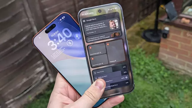
For years, Android was considered the pioneer of mobile widget technology, allowing users to customize their interface long before Apple adopted the concept. However, the tables turned when Apple introduced lock screen widgets with iOS 16 in 2022, a feature that felt polished and integrated directly into the core user experience. Since then, Android has officially caught up, bringing back revamped lock screen widgets in Android 16 and continuing the evolution into Android 17. But with both platforms now offering these features, how do they compare in practice?
The Setup Process
Setting up lock screen widgets differs between the two ecosystems. On Android 17, users can typically access their widgets by locking the phone and swiping from the right edge, where a prompt invites them to add widgets. The process is modular, mirroring the familiar home screen customization workflow. Conversely, iOS 27 retains the Apple signature approach: a long-press on the lock screen triggers the 'Customize' mode, allowing users to drag and drop widgets into a dedicated, single-line bar.
Design and Functionality
Apple’s implementation in iOS 27 is highly aesthetic but restrictive. Users are limited to a single horizontal row, forcing a more curated, 'at-a-glance' approach. While this keeps the lock screen clean, it limits the complexity of the data displayed. Most iOS widgets focus on static status updates, calendar events, or basic health metrics.
Android 17, by comparison, offers a more robust, multi-page system. You can stack multiple pages of widgets, with each page supporting up to three widgets regardless of size. This allows for significantly more screen real estate, though it comes at the cost of potential visual clutter. Android widgets also tend to be more interactive, often allowing for direct control over smart home devices or system toggles without requiring a full unlock—though sensitive actions still require authentication.
The Verdict
Which platform wins? It depends on your priorities. iOS 27 excels at glanceability, putting vital information right where you need it, which helps preserve battery life and simplifies interaction. However, Android 17 is the clear winner for power users who want deep, granular control and the ability to have an entire dashboard of information just a swipe away. Ideally, the future of mobile OS design would be a hybrid: the high-visibility, polished integration of iOS with the expansive, power-user functionality of Android.
Comments (0)
Sign in to join the conversation.Sign in
Loading comments...